Friday, September 4, 2015

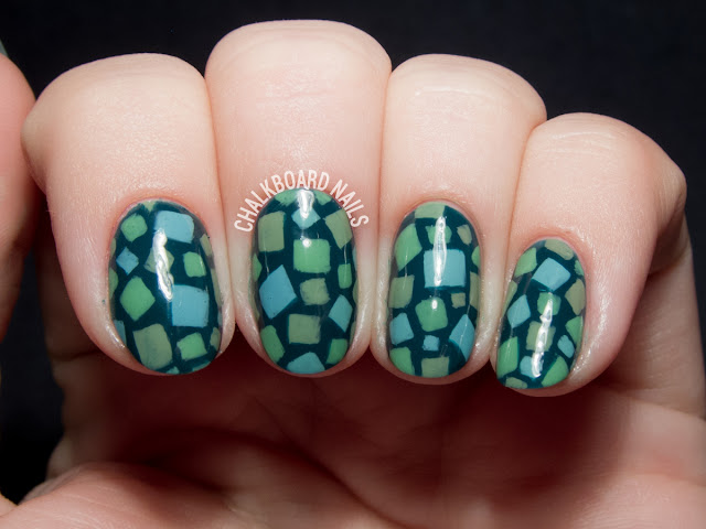
Animal Crossing grass pattern nail art via @chalkboardnails

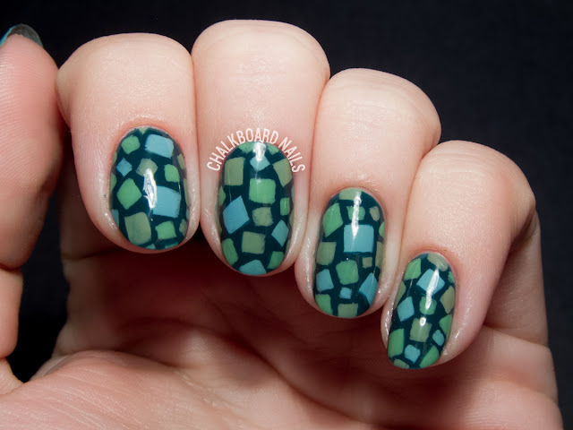
Green day of the 31 Day Challenge is here! I decided to try a pattern that pays tribute to one of my favorite video games: Animal Crossing!

This pattern is inspired by the grass pattern that is displayed in summer. I chose colors a little darker than the daytime palette, so let's just say that this is an evening look!

Animal Crossing grass pattern nail art via @chalkboardnails

I used the following polishes for this nail art:
LVX Viridis (base)
Essie Mojito Madness (lime green)
LVX Paraiso (blue mixer)
LVX Truffle (brown mixer)

I freehanded the squares with the short end of my Edinburgh Realism 3/4 brush. After they were all on there, I went back with Viridis to clean up the edges of the squares. It's a small step that really made a big difference in the finished look!

Animal Crossing grass pattern nail art via @chalkboardnails

Here are my green manicures from the past four years of the challenge.

Tuesday, September 1, 2015

Garnet Glittering Gradient Grid Gels by @chalkboardnails

It's the first day of the 31 Day Challenge! If you're totally confused about what's going on, be sure to check out my 31DC FAQ page, which will answer all of your questions.

The first prompt of the challenge is "red," and -- what luck -- I was already wearing red rockstar glitter gel nails!

So the big goal for this manicure was to try to improve on my gel gradients, which were not as strong as I want them to be. I picked black to use as my gradient color, and sponged it on with clear gel to create the fade.

Truthfully, the method I used for this gel gradient is the same as if I were using regular polish, but with a few small modifications. Here's the gist:
  • Cut your makeup wedge sponge into a thin strip to help minimize mess.
  • Paint stripes of the colors you want to use on the sponge.
  • Tap it LIGHTLY on to the nail. Don't overtap, as this can pull the gel back up off the nail. If you're used to sponging gradients with regular polish, you'll definitely have to modify your pressure to make it lighter.
  • Clean up any mess on your fingers before you cure in your gel lamp.
  • Cure between each round of sponging.
  • I did four or five rounds of sponging, cleaning, and curing for this manicure.
After the gradient was looking good, I painted on a black grid that faded away into the darkest parts of the nails.

Garnet Glittering Gradient Grid Gels by @chalkboardnails

Products used:
CND Shellac Base Coat and Xpress5 Top Coat
Recollections glitter in Cherry
DIY Hard Nails - Black Cat (black gel)
Akzentz Gel Play in black (grid pattern)

My previous red 31DC manicures:
Crab print and nautical mix

Sunday, March 22, 2015

Monochrome geometric nail art by @chalkboardnails
Despite the fact that I haven't seen or read 50 Shades of Grey, I think we all know the basic gist of the story. OPI's 50 Shades collection includes a range of six shades - five greys and a red - and I used three of them to create this nail art look today. I chose a geometric pattern, one that you might find on a necktie, which fits with what I know about the story quite well, I think.

Monochrome geometric nail art by @chalkboardnails

Nail polish used:
OPI Embrace the Grey
OPI Dark Side of the Mood
OPI My Silk Tie

I began by painting my nails with two coats of Embrace the Grey. It applied smoothly and evenly, like OPI cremes usually do!

I painted on a freehand square pattern using Dark Side of the Mood, and then added the silvery squares inside them with My Silk Tie.

What do you think - Christian-esque?

Monochrome geometric nail art by @chalkboardnails

Ya know, even though I haven't seen the movie or read the books, I can get behind a good geometric pattern any day of the week! What about you - have you "Embraced the Grey"?

Friday, February 20, 2015

Plum honeycomb nail art by @chalkboardnails
Japanese nail art is so inspiring to me. Lately, I've been seeing a lot of honeycomb shapes with extremely fine lines, and I wanted to give them a shot for myself. Though I know most Japanese nail artists work with gel, I thought I'd give the pattern a go with regular polish. It was definitely a challenge, but I was pretty happy with the way they turned out.

The trickiest part was figuring out how I wanted to approach the honeycomb pattern. Here's the order that I ended up using for the linework.

Plum honeycomb nail art by @chalkboardnails

I used two polishes:
LVX Mineral
LVX Vamp

The pattern was painted freehand with an Edinburgh Realism 3/4 brush from Stylish Nail Art Shop. It took a while at first, but then I got into the geometric groove and it went a bit more quickly. This is one of those patterns that would also work really well as an accent nail, if you don't want to commit to a full hand of linework.

Plum honeycomb nail art by @chalkboardnails

Plum honeycomb nail art by @chalkboardnails

I know the lines can look a little hairy in macro mode, but they really came together in person. Thems the breaks!

P.S. If anyone is in the Los Angeles area, I will be at the Rite Aid on Sunset from 12-5pm tomorrow (Saturday the 21st) doing nail art with Work/Play/Polish and Julie G! Come by and say hello! Full details here.

Saturday, January 3, 2015

Color blocked nail art by @chalkboardnails

There's a new collaboration in the nail world, and it is fantastic. Victoria Beckham teamed up with Nails Inc. to release two new shades that draw inspiration from her Victoria, Victoria Beckham SS15 collection: Judo Red and Bamboo White. They don't come cheap, but I think they are worth your consideration. Let's talk why.

Nails Inc x Victoria Beckham via @chalkboardnails

The first selling point? The bottles are AMAZING. If you are a sucker for packaging like I am, you will go bananas over these bottles. The matte black and matte white finishes feel soft to the touch. The bottles are incredibly weighty and feel like they are of a very high quality. The design features a removable overcap with a smaller round brush underneath, and the brush itself is very wide (which I personally love in a brush).

And, lest you're worried about not seeing the polish color, they've cut out a handy window on the sides of the bottles for peeking.

Color blocked nail art by @chalkboardnails

Okay, so the bottles are nice. But what about the formula?

It's totally, really great.

For this blocked nail art, I started out with a base of Bamboo White. As I applied my first coat, I actually gasped in happiness. It goes on remarkably smoothly and evenly, and covers perfectly in just two coats. It's really shiny too, for those of you (crazy people) that don't use topcoat.

Color blocked nail art by @chalkboardnails

Judo Red tells the same tale. Here it is alone at two coats, no topcoat. It leans heavily towards orange, without being unflattering.

Nails Inc Judo Red via @chalkboardnails

As I said, the only downside to these is the price. At $25 per polish or $45 for the duo, they are expensive (especially for shades that you might already have dupes for in your collection). However, the amazing formula and quality bottle design make these worth a second look for the avid collector or luxury lover.

US residents can pick these up from Nails Inc. and Sephora. UK residents can shop via Selfridges.

Wednesday, December 3, 2014

Wasabi and Caviar by @chalkboardnails

Today is my birthday, and if you can believe it, my nails are actually naked right now! THE HORROR! I'm hoping to put something fun on them after I get home from work, but for now, I wanted to share a manicure I spent a lot of time on recently.

I am calling it wasabi and caviar for reasons that I hope are obvious! This entire design is handpainted with regular nail polish. It's some of my best linework to date, I think. Hooray for improvement there!

Wasabi and Caviar by @chalkboardnails

Nail polishes and products used:
LVX Midori
Formula X Dark Matter
Sally Hansen Stud Kit

If you want to attempt a design like this, I've got some tips!
  1. Get a small brush. I can't tell you how long I used a thicker nail art brush, cursing my lack of talent rather than the tool I was using. Once I got a thinner brush, it helped me immensely. I still had to keep practicing, but my old brush was definitely part of the problem. Trim down an old brush with cuticle nippers if you don't have a super thin one.
  2. Keep it clean. If you're using polish (instead of acrylic paint or gel), clean your brush frequently with 100% acetone and regularly put down more polish onto your palette. Polish dries quickly and can wreck your fine lines if it isn't the right consistency.
  3. Small mistakes aren't the end of the world. You can use a clean nail art brush dipped in acetone to gently "erase" small mistakes from your work; just be careful not to go too crazy or it will eat through your base color. In this case, I put a layer of topcoat between the wasabi shade and my black linework for extra protection.
  4. Be patient. This shit isn't fast. When you factor in my previous tips and the detail of the work, you just gotta know it's not going to be easy to bust it out in 45 minutes. I like to put on Netflix and take breaks every so often to stretch out.

Wasabi and Caviar by @chalkboardnails

I just love this kind of strange green color, and the thick blingy stud nail is just the right amount of "odd" to go with it.

Tuesday, October 21, 2014

Geometric Gradient Nail Art by @chalkboardnails

As you may recall, back in August I showed off the Nailbox Pre-Fall 2014 Trendbox, which I curated! The box includes four nail polishes plus a matte topcoat, and I've used all five bottles in my nail art today. Nailbox has also given me the chance to offer a giveaway for the box, so head to the end of the post to enter to win!

Geometric Gradient Nail Art by @chalkboardnails

Nail polishes used:
LVX Cashmere
NCLA Santa Monica Shore Thing
Orly Hot Tropics
Priti NYC Chyrsanthos
Essie Matte About You

I love the way these colors look together. I'd hope that I would, anyway, seeing as how I chose them! You've got the nice neutral base, two bright and fun shades, a metallic for some pizzaz, and a matte topcoat (because I am obsessed with all things matte).

The gradient effects are entirely handpainted. I didn't use tape or vinyls in this look, and honestly, these days it's just become easier for me to try to freehand it than to go through the process for anything else. The lovely periwinkle color between the aqua and the pink was created by mixing the two together, and I brushed it on loosely to sell the transitional effect.

Geometric Gradient Nail Art by @chalkboardnails

Nailbox Pre-Fall '14 Trendbox curated by @chalkboardnails

My Pre-Fall 2014 Trendbox is available as a single box for $35 (a $65+ value) or you can purchase the one year subscription for $126. Boxes are curated by nail bloggers and trendsetters. GET IT WHILE IT'S HOT!

Feeling lucky? Try your hand at winning a Trendbox! Giveaway is open to US residents and ends October 28th, 2014. Prize provided by Nailbox.

Nailbox Trendbox Giveaway
Disclosure: I was compensated for my participation in the Pre-Fall Trendbox, but was not paid for this giveaway. Good luck!

Tuesday, September 16, 2014

Geometric gradient facets by @chalkboardnails

One difficult thing about the 31 Day Challenge, for me, is that even if you have extenuating circumstances (like, say, you fall asleep watching Monday Night Football), you still have to get the next day's manicure done. When I woke up on the couch at 1:30am this morning and realized I had geometric nail art to do, it was pretty tough to drag my ass over to my nail table. BUT I DID IT! Because that's how I roll.

Geometric gradient facets by @chalkboardnails

Nail polishes used:
Misa Dusty Magnolia (nude)
LVX Orchid (pink)
Misa Loveliest of Lilacs (purple)
JINSoon Cool Blue (blue)

The technique for this nail art is pretty simple to break down. I painted my nails nude, and then began adding geometric facets with a small nail art brush and pink polish. About a third of the way down the nail, I started doing the facets with purple. Two thirds of the way down, I did the facets in blue.

The last step was to blend the gradient. I created custom blends of pink/purple and purple/blue, and painted them in the areas where the colors met. It looks pretty seamless, especially at arm's length.

Geometric gradient facets by @chalkboardnails

This year, I've changed the "tribal print" prompt to geometric in an effort to be more culturally sensitive. Here are the manicures I've done in the past:

Friday, July 11, 2014


This month's Sally Hansen I Heart Nail Art theme is "Electric Summer"! Its inspired by contrasting shades and looks that will pop against tanned skin. While I don't have the "tan" part down, I can still bust out a mean summer mani that will look great on anyone's hand. Read on for the details and a tutorial for how to achieve this look for yourself.


I used three Sally Hansen faves for this nail art:
Sally Hansen Xtreme Wear - Coral Reef
Sally Hansen Insta Dri - In Prompt Blue
Sally Hansen Insta Dri - Lightening

You will also need some sort of tape to make the triangles. I'm using washi tape but scotch, striping, or painter's tape would also work just fine.

  1. Paint your nails with 2-3 coats of Coral Reef. Let dry completely before moving on to the next step (I like to use a quick dry topcoat to cut down on waiting time). 
  2. Apply two pieces of washi tape to your nail to create a triangle near your cuticle. Press down to ensure a good seal with your nail.
  3. Paint over the exposed area with In Prompt Blue. 
  4. Working quickly, use a small nail art brush to paint thin stripes of Lightening going in all different directions.
  5. Carefully remove the washi tape and finish with topcoat.


I paired this summery look with a neon and gold chain bracelet from BaubleBar. While I don't think this one is still up for sale, you can browse their extensive selection of neon and chain bracelets here.


Enter the Sally Hansen #IHeartNailArt contest at sallyhansen.com for a chance to win $500 and a trip to NYC to compete in the grand finale. The grand prize winner will become a Sally Hansen nail art ambassador and receive $2000! No Purchase Necessary. See Official Rules for full details.

Disclosure: This post is sponsored by Sally Hansen. Products provided by PR.

Tuesday, February 4, 2014


While I originally guessed I'd be drawn to the brights in OPI's Brazil collection, when I got them all together, I really responded to the way the four neutral/earth tones looked. I couldn't get the group of them out of my mind. I had a hankering for some geometric nail art, and for this look I drew some of my inspiration from a DIY geometric necklace tutorial.


OPI Don't Bossa Nova Me Around - This is the lightest neutral, and the shade that I used for the base of the manicure. It's more pink that my camera was able to capture here; the shade kind of reminds me of Silly Putty. Definitely a very flattering nude, it'd be a perfect shade for someone whose skin tone leans pink rather than yellow. Covered perfectly in two coats.

OPI Taupe-less Beach - The second lightest shade shown here, this polish is a lovely greige. It was nicely opaque for this nail art and is a perfect step between Bossa Nova and the next darkest color.

OPI I Sao Paulo Over There - The darkest taupe shown. I always enjoy medium earthy shades like this and I found the formula easy to work with.

OPI OPI Scores a Goal! - This rich red-brown shade is the standout "accent" here. While the three previous polishes are fairly neutral, this one does bring a bit more to the party, color wise. Like the others, the formula didn't give me any trouble.


I painted all of my nails with a base of OPI Don't Bossa Nova Me Around, and the rest of the geometric shapes were painted freehand on top of it with a super skinny nail art brush.

The key for me was to paint one large geometric shape near the center of the nail and then build outwards from that. Another important thing I had to remember was to leave some spaces "unpainted," at least with the freehand, so the base could show through and do its part.


Check out a behind the scenes shot from this manicure on my Instagram; you can see my bitty nail art brush and polishes, plus the wax paper that I put down on my table as a palette.

While this nail art took forever (an episode of The Ellen Show AND @midnight), I'm very pleased with the final outcome. It gave me some good practice on my linework and on making the brush stop exactly where I need it to so the facets would match up.

Brazil by OPI will be available beginning tomorrow, February 5, 2014. Nail lacquers will retail for $9.00 ($10.95 CAN) each at Professional Salons, including Beauty Brands, Beauty First, Chatters, Dillard’s, jcp Salons, Pure Beauty, Regis, Trade Secret, ULTA and ulta.com.

Sunday, November 10, 2013


As I was unboxing the LCN Charade set, I was struck by how "70s chic" the colors looked together. The mustard yellow, the sage green, the burnt orange! I knew they absolutely must be used in nail art together. I ended up doing a pattern combination that made me think of that crochet blanket that you've probably seen at your grandma's house. You know which one I mean -- it's likely older than you are & probably isn't all that warm, but it's awesome looking and you know it's seen some stuff in its day.

Hopefully this manicure manages to capture the vintage feel while modernizing the style a bit.


There are four colors in the LCN Charade Collection, all named after iconic Hollywood stars.
  • Audrey is a dark, almost smoky green with subtle gold glitter.
  • Liz is a sultry berry creme shade.
  • Marilyn is a deep orange shade... perfectly fall like a pumpkin.
  • Rita is a honeyed yellow. 

Each of these shades required just two shades for opacity, including the yellow. Some of them were close to one coaters, so if you apply your coats a little heavier, you may need just one. The formulas were wonderful and smooth, nicely pigmented, and applied evenly.


I freehanded on the different patterns with my small nail art brush. I began with each nail painted a different color so they would be sure to look different from each other.

I stayed with geometric and angular patterns: dots, triangles, chevrons, squares. I think my middle finger and thumbnails turned out the best!


These polishes are available via lcnboutique.com as a box set for $24.90. You can also shop the colors individually for $7.50 per polish. If you've never tried LCN polishes and are a fan of great cremes, I'd suggest giving them a shot! I'm always pleased with their releases and the colors in the box sets always work well together in nail art.

Tuesday, October 1, 2013


It's the final day of the challenge and the prompt is "honor nails you love." This is a way of paying it forward to the nail art community and giving props to someone's awesome creativity! I chose to do a manicure inspired by Nailside's Abstract 80s design.

Nailside is the queen of tape manicures, and I hope I did her work justice with this! There are two taped elements here: the right angles in the pink pieces and the blue triangle over the top.


The lighter pinky purple shade is Misa Ripe Raspberry. I applied two coats and let it dry completely before taping off right angles with stationary tape. I then applied one coat of Misa Lovely Lychee.

After letting THAT part dry, I taped off triangles and painted one thin coat of Color Club Chelsea Girl. This bright blue shade has a kind of jellylike consistency which is important in this look! You need it to be that way so that it looks different when it is layered over the each of the two different base colors.


I do miss Nailside's posts, she has been on hiatus since April! She is so precise and her work is always so on point.


Can you believe that the 31 Day Challenge is already over? It seemed to go so fast this year! Of course, it was as stressful as always, but I'm so proud of the work I was able to do.

I'm also so proud of those of you that participated this year! It's never easy to complete the challenge and you all owe yourselves a cupcake. Or two. Or ten. OR THIRTY ONE!

Look out for my roundup post tomorrow where you can sound off on your favorite looks!

More 31 Day Challenge
The 31 Day Challenge introduction!
My "recreate a manicure you love" nails from 2012!
My "recreate a manicure you love" nails from 2011!

Thursday, August 22, 2013

LCN is bringing the heat for summer with the Shades of Desert Collection. While the four piece collection boasts a bold red and a sexy magenta, the two less feminine shades in the collection jumped out at me immediately: a spicy burnt orange and a cool, dusty turquoise.


For this look, I began with a base of two coats of LCN Fiery Cumin. The formula on this yummy toffee shade was wonderful and buttery, just like I've come to expect from LCN polishes.

Then, I grabbed my small nail art brush and LCN Blue Oasis. I painted on lines and right angles for a sort of random-yet-rigid effect. I really like the way that the pattern turned out and I know I will be doing more of these looks going forward! Like Fiery Cumin, the formula on Blue Oasis was without fault.


What do you think of this look? Are these two colors that you would wear together on your own nails?

The LCN Shades of Desert Collection is available now via the LCN Boutique. They are available as a box set of all 4 polishes for $24.90 or individually for $7.50 each.
nghe nhạc trực tuyếnNấu món chay | học nấu ăn DJ - Ảnh đẹp | xalotinnhanh