Saturday, January 31, 2015

I guess I'm cutting it short showing you the last of the four theme challenges post the 31st of January, but that still counts. ;) As you might know by now I've joined the nail challenge collaborative where we show four nail art's according to a specific theme each month.

This month the theme is wallpaper and as I said in my first post I decided to do a little "history lesson", doing my nail art's inspired by the wallpaper/interior designs of certain decades, going back in time. My last post was inspired by the 50s and today I'm showing a 30s wallpaper nail art.

Source 1 (refrigerator), Source 2 (yellow roses), Source 3 (pink roses)

I decided to skip the traditional art deco style which also was popular during the 30 and fell for these rose patterns. I decided for a gray base where I did a saran wrap with two gray polishes. Then I freehanded yellow roses. As the middle picture I decided for orange shadows in the roses and I also drew some leaves. Basically I'm pretty happy with the result, it looks like a painting in some ways because it's not so detailed. Also, much as a wallpaper I think it look the best from a distance, when I'm looking really close I think it looks weird. :P


Polishes used:
La Femme (gray)
KIKO - 329 (light gray)
KIKO - 368 (orange)
Essence - Love Is In The Air
Jordana Pop Art - Contemporary White


Wednesday, January 28, 2015

Time for my third nail challenge collaborative post this month with the theme wallpaper. And as I said in my first post I decided to do a little "history lesson", doing my nail art's inspired by the wallpaper/interior designs of certain decades, going back in time. My last post was a 70's wallpaper nail art and next leap is into the 50s.

Source 1 (wallpaper pattern), Source 2 (yellow kitchen)
Well, obviously the 50s wasn't all yellow, I just happened to fall for that and I liked the pattern. The yellow kitchen is from 1959 and the wallpaper there is actually chickens. I also saw a blue kitchen in the same tone.

Basically I used the pattern from the wallpaper, yellow base, stripes and dots in white and gray, which looked kinda graphical and cool. The photos came out kinda weird (think it was dark when I took these) but overall I like this.


Polishes used:
Essence - Love Is In The Air
La Femme (gray)
Kleancolor - White
Jordana Pop Art - Contemporary White


An InLinkz Link-up

So what do you think? Anyone with knowledge from the 50s, did you see any yellow styling back then and also do you recall any other colors, color tones at that time? :)

Friday, January 23, 2015

Time for another nail challenge collaborative, the second this month with the theme wallpaper. And as I said in my first post I decided to do a little "history lesson", doing my nail art's inspired by the wallpaper/interior designs of certain decades, going back in time. My previous post was early 21st century, with some sort of past present time and today I take a major leap into the 70s.

The 70s was a colorful period of time; wallpaper and interior design wise. A main color seem to have been bright orange as accent, often combined with yellow, red and brown as seen below. Quite often I've noticed avocado green details too (even seen a full kitchen in avocado green). My mom told me that her mom (my grandmother) painted their bathroom bright orange during the late 60s.

Source 1 (dots), Source 2 (stripe on white), Source 3 (stripes again)
Onto my nail art. I struggled a bit with this one for no reason, had a bad nail art day and redid some nails 3-4 times and when I was done I accidentally dipped my undried nails when cleaning away my bottles.. Just to redo, again, lol. I went all in for the dots and my original plan was striped accent nails but that failed so at the end I decided to make swirls, using the needle dragging technique. The swirl technique I've done before in two colors (b&w), but this time I decided to use four colors and it became quite cool. I'm quite happy with the result but I think it could have looked way cooler and I'll probably try a 70s nail art more times. Hope you'll enjoy.


My dominant also got dots, really cool like that too I think. ^^


Polishes used:
KIKO - 324
P2 - Dating Time
Essence - Polka Holga
Essence - Love Is In The Air


Tuesday, January 20, 2015

This month in the Nail Challenge Collaborative the theme is wallpaper and at first I was a bit "meh" about it, but then I got super excited when I realized the options of it. My thought span was from computer's wallpaper to the actual wallpaper and then I decided to narrow it down further and do a tiny history lesson of it. Wallpaper is part of interior design and during the century different trends have been standing out. As you know NCC only have 4 designs so I've narrowed it down to that so there will be some jumps in the decades. Also I would like to point out that there isn't any right's or wrong's here, just because I choose one color combo that wont mean that there weren't any other and also the color trends might have occurred during different times/decades in different places over the world. And on top of that a lot of people use to stick with an interior design of a specific time for decades, like at my grandparents place it was a lot of 60s stuff also in the 90s.

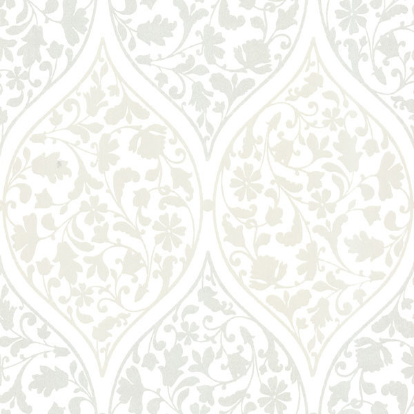
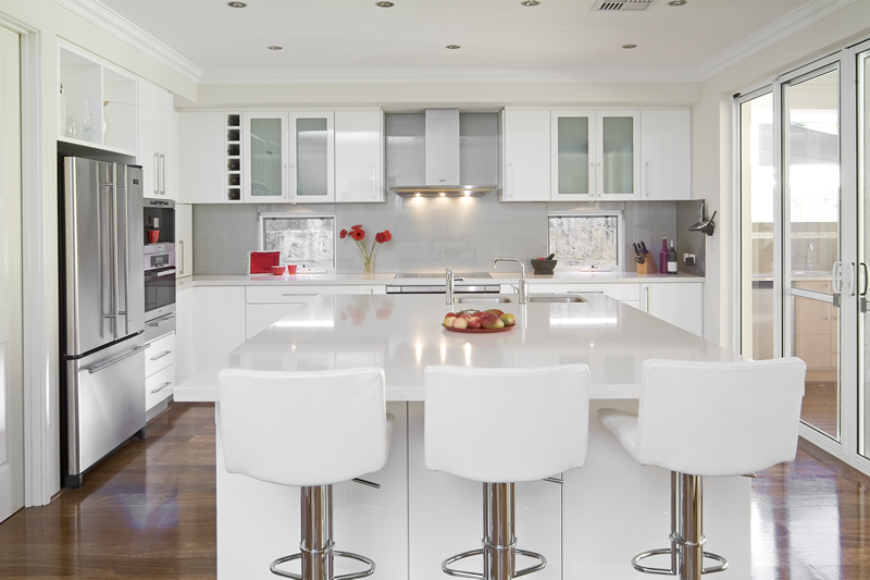
My first wallpaper nail art is some kind of early 21st century nail art, like from late 90s to 2010ish. And there has been a super white era during this time talking about interior design. In Sweden (at least) there has been a hype (which is slowly fading out) to paint (or buy) literally every item in your home to white, with some few tiny details in other materials or colors, like silvery metal/glass or occasional white glazed wood. It's a feminine rural style, sometime shabby chic.. Also don't forget about the large wooden letters on the wall saying "love" or "family".. Today I can mention that this white+silvery has changed to white+copper or white+brass for the trendy ones.

Source 1 (living/bath room), Source 2 (wallpaper), Source 3 (kitchen)
So.. onto the nail art, in an aim to keep to whole interior of a home white, there still has been some patterns on the wallpaper, like subtle metallic patterns. Here I chose a white base and then stamped a holographic pattern using Color Club - Harp On It with the Born Pretty Store Stamping plate QA88. An image plate I won from MoreNailpolish. :) Stamping with CC was awesome, worked great and the holo was visible, but subtle due to the thin lines and I must say this was one which looked better IRL. It was hard to photograph, if it got dizzy or too light the pattern doesn't show, but at least you get the vision. I also added some pearl rhinestones to fit the romantic and feminine style.


Sunlight so here you can see some of the holo in the stamping.

Polishes and materials used:
Color Club - Harp On It
Nordic Cap - NP13
Squishy XL stamper from eBay
Born Pretty Store Image Plate QA88

This is the image plate I won at MoreNailpolish. (lol, I just had to take the photo after the stamping) and I must say it worked great, sharp pattern and easy to pick up. I can recommend it and if you decide to get it from BPS I have my 10% discount code for you to use; NGL91.


An InLinkz Link-up

So, do you recognize this interior design/wallpaper trend from where you're from? Do you like it the "white trend" or do you prefer other colors/combos in your home? Tell me. Also what do you think about the subtle stamping? :)
nghe nhạc trực tuyếnNấu món chay | học nấu ăn DJ - Ảnh đẹp | xalotinnhanh