Tuesday, August 25, 2015

Hi, today I have some pics of a nail art that has been laying in the archive for quite some time. I showed you the swatch of Lavender Star in the beginning of this month, but these where done months ago. I really like the idea of texture nails + nail art so here is a try with freehand. Both the white and purple are texture polishes, even though I realize that I could have used a regular white too. A fail I think is that the hearts got very thick, and even though they dried they never looked as textured as the rest. Not my favorite nail art ever, but maybe you'll like it anyhow. :)


Polishes used:
Rival de Loop - Lavender Star

R de L Young - Foo Whiters 

I'd also like thank all you lovely readers who look in here every day, and also you commenters. That means a lot to me! <3

Friday, August 7, 2015

Today I'm showing some archive photos of the bright purple creme texture from a Rival De Loop LE collection called Colour Star Sand Effect. It's creamy and has a very pigmented formula which is easy to apply, could probably work with only one coat but I decided for 2 coats. Lavender Star isn't the most textured polish out there, however I like it and I'm looking forward using it in a nail art.


1.49 euro (on sale) at rossman.

I miss my long nails but I don't mind my current length either. :)

Wednesday, August 5, 2015

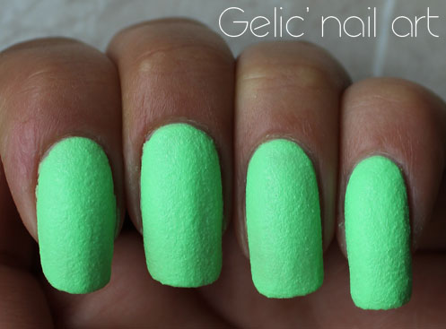
Saint-Tropez is from the "Effect Sahara Crystal" collection, from what I read of the cap. The color is neon cold toned pastel green, a color which is too bright for my camera to handle so my skin looks super tanned.. The formula was a bit thick and yoghurt like (this is the second time this happened to me, the other was this HM polish (Norwegian Sky), however with 2 coats it covered. The finish is what some other brands call leather, and I must say I like that texture kind of look. The down side is that despite of 2 coats it's VERY slow drying, I could dent it 2 hours after applying the second coat. Next time I'll try using those fast drying drops. Anyhow, I like the color a lot and this is also my contribution to Green Wednesday! :)


This was from a nail polish swap/gift.

Wednesday, July 29, 2015

The theme in the Nail Challenge Collaborative is Travel. And a very common way of travelling is by car these days. Even car vacation's are common, I remember from being a child that my family once went to north Europe by car, we went to Denmark, The Netherlands and a quick visit to Germany.

My 3rd post is therefore a car nail art, stamped with BornPrettyStore's BPL-022 image plate, which just happens to contain a nice car print. Somehow it felt like I had a bad stamping day and some of my cars are crashing, but some day I'll be a stamping pro ;) I guess practice makes perfect, and can't wait to try the other patterns too. I also did my first try stamping on top of textured polish, with the full print on all nails, except my accent where I just did one car and some black rhinestones. I used a green bright base for this and I'm also joining Green Wednesday. :D


Polishes and materials used:
Dance Legend - Saint-Tropez
MoYou's special black nail polish
Black opaque rhinestones - triangle shaped
Born Pretty Store Image Plate BPL-022 (itemID: 20787 http://www.bornprettystore.com/geek-pattern-nail-stamp-template-image-plate-born-pretty-65cm-p-20787.html)

The image plate is of a larger size and is 12.5 x 6.5cm and each pattern is 2,5 x 1,5 cm which makes them perfect for my nails (I can't use Konad's full-nail-images for example). The reason why I decided to try this image plate, called "geek pattern" is because it has a lot of fun full size pattern. I'm really stoked about the circuits, gears, cars, air planes, umbrellas, sunglasses, hangers, shoes, pencils and "fun faces" (even if that one isn't as long as the rest), I'm less into the soccer and speech bubble pattern. So basically I have so many fun nail art ideas with these to come!

At the moment BornPrettyStore has a huge 50% sale on stamping plates til' the end of July, but if you want something which isn't discontinued from their stash, feel free to use my 10% off code which is NGL91. 

***Some products in this post have been provided for review, however it has not changed my opinion about them.***


Thursday, June 4, 2015

Hi! Long overdue, here is the full collection of P2's Crisp Color collection from spring 2015. I ended up buying all eight, just because I really wanted some matte textured polishes and a full collection is always fun. Each bottle is 2.45 euro at DM (Drogerie Markt, found in Germany).


So, a general summary then. There is 8 colors and all of them, except for the brown, has been seen before, as dupés or very similar in other brands like KIKO, BeYu, LOOK etc. So basicially there has been plenty of opportunities to grab them.

All except the brown has a pastel feel to it, white has been mixed into it combined with colors. The brown is more of a jelly based polish and I wouldn't even consider it to be pastel.

All except the brown needed two very simple coats. Some of them are almost onecoaters, but they kinda need that last second coat to cover perfectly. The brown being more of a jelly needed three coats.

Drying time is  normal for the textures, like 25-30 min (since you know, no tc is added because that would ruin the effect, I haven't tried drops if that makes the drying time faster though). I think that the brown needed 30-35 minutes and that probably because of that third coat messing the time up.

All of the polishes has shredded matte particles in different colors, which looks like hard plastic but I' not sure. However they do look cool with it. There are three combos of shredded particles color combinations as below in this collection:

Red and brownish violet shreds: Found in the purple (Violet Glace), yellow (Honey Fluff) and brown (Toffee Time).

Red and bright blue shreds: Found in the blue (Blueberry Dots), green (Cool Milkshake) and pink (Strawberry Frosting).

Red only shreds: Found in the two orange tones. (Cotton Candy) and (Peach Icing)


And deciding which ones I like the most is very hard but I've tried at least, and my choices are only based on my own colors of liking and I might change my mind another day. So as you see, the purple I liked very much, closely followed by the blue and the yellow (the yellow would have been no one or two if it would have been more brighter). The green is cool and minty but I'm also (for a change) drawn to the cute and bright pink as well (They could swap places in my list). After that we have the two pastel orange and the brown. And to be honest those three are much the same to me (I know a lot of people might disagree), but I'm having a hard time with pastel orange.. The more nude orange is maybe better but it also reminds me of rust protection spray.. And I actually like the brown, not because it's pretty, but because it's unusual and I'm thinking of some cool nail arts with it. ;) So it's that too, wearable on it's own only, or not wearable on it's own and nail art combination possibilities too which is part of my choices.

For each post (with additional info and more pics), just click the link in each picture:

Violet Glace

Blueberry Dots

Honey Fluff

Cool Milkshake

Strawberry Frosting

Toffee Time

Cotton Candy


Peach Icing

And for fun, how would you arrange these, from top to bottom, which ones you like the most? And also if you have some nail art thoughts about these? I have some plans but fun if you have too. :)

Sunday, May 10, 2015

This is the black sheep in the collection, I assume more pinks will be sold than brown at least. ;) But it do feel super unusual and not even KIKO had a brown like this. And I just had to have it.. it's too weird to miss out on, at least for me.

The base color is a light (but not necessarily pastel) and cold toned brown, like mud and more like the color taupe (purple undertones) than chocolate brown. The others from the Crisp Color collection also feel like they're mixed with "white" and they're crelly like while Toffee Time is more jelly. In this one the shredded particles is red and that dark brown. Surprisingly this was much thinner than the other in the collection. Most of them have been quite thin on the first coat, but because of the texture, the second coat has filled them up perfectly. However here I needed 3 coats and therefore this probably is slightly more slow drying. I actually don't think it's that ugly, it feels unusual and is definitely unique in my stash. 


2.45 euro at DM.

So people, what do you think about this? Is this cool mud or is it poo? Does this makes your face wrinkle in horror like Mrs Data described some previous textures or do you find it interesting?

Saturday, May 9, 2015

Honey Fluff (isn't that name fun btw?) is a yellow pastel with red and that dark brown/violet shredded particles in it. I was hoping for the yellow to be more bright and clear yellow, but it reminds me more of a muted nude/orange yellow tone. It's nice but will not be the super favorite I assumed it to be, even though I of course like it a lot. Application was easy and I needed 2 coats.


2.45 euro at DM.
nghe nhạc trực tuyếnNấu món chay | học nấu ăn DJ - Ảnh đẹp | xalotinnhanh